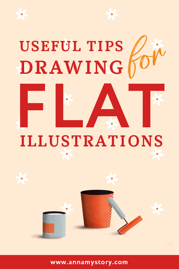
Flat illustration Tutorial: 5 Pro Tips for Designers
So what is flat illustration design style?
It is a minimalistic and concise style in graphic and UI design, known for its simplicity, minimum of details and effects, and sleek forms.
You can find it practically everywhere nowadays – on web sites, smartphone applications, branding and even editorial and advertising. Flat design has a huge impact on contemporary illustration and defines trends in creating visuals significantly.
Top 5 helpful tips for everyone who wants to learn how to draw cool flat illustrations. Whether you are new to creative art or already made it your job, getting comfortable with creating flat illustrations is a must. The reason is simple – it’s a strong trend which is not showing any signs of slowing down any time soon.
Whether it’s an illustration for website, an info-graphic piece, an icon set or brand key visual, I hope these tips will help you to make it right.
1. Keep it simple and balanced

Flat design is all about simplicity and minimalism. To make your design look neat don’t over-complicate it with unnecessary details or effects. You must define the key element (like a character or an object) and build your scene around it. Of course, you can add slight details to make the whole composition more vibrant. But simplicity is always the key.
2. Add white space

One of the main methods to make your composition more balanced and emphasize on the right element is using white space. When you have a complex composition (like a group of characters or environment with a lot of objects) white space really helps to make your image look cleaner and minimal. It may seem easy to do, but can be rather tricky when it comes to actual work. It’s all about practice.
3. Use geometry

Flat design is often based on geometric shapes and repeating angles. It makes Adobe Illustrator a very handful instrument for this kind of style. Even if you don’t have an artistic background you can create something nice using rectangles and circles if you are aware of simple laws of composition. I’m sure it’s another reason which has made flat design so popular nowadays 🙂
4. Don’t be afraid to implement bright colors

Flat design has its limitations. Color and contrast play a major role in making your image pop up and stand out in a row of similar images. Don’t be afraid to use bold colors and high contrasts in your work. It’s also a good practice to use bright colors while adding one-two neutral colors to make it more deep and balanced.
5. Apply additional details

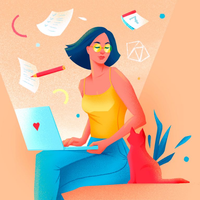
With tones of flat illustrations created by different artists over the years sometimes it’s difficult to make your flat imagery look unique. You might have already seen a lot of web illustrations in blue and pink, a lot of flat blue-haired girls and plenty of faceless bearded guys with laptops 😉
Fortunately, we can see a rise of a new trend of semi-flat design lately. It offers us additional ways to create more personalized images. And I’m really encouraging you to use slight shadows, a bit of texture and pattern etc. In other words anything that will express your style and visual voice.
Conclusion
Love or hate it – but flat illustration is here to stay for at least the next year or two. So my advice – if you’ve never tried it before it’s a good time to learn how to create flat style illustration. And if it’s already part of your work there is always way to improve it.Hopefully my tips will help you with that.
If you enjoyed the article – feel free to share the knowledge, leave your comments and SUBSCRIBE to my newsletter.
Save in Pinterest for later 😉