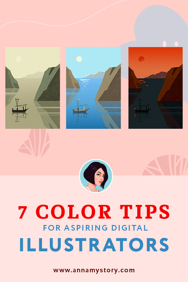
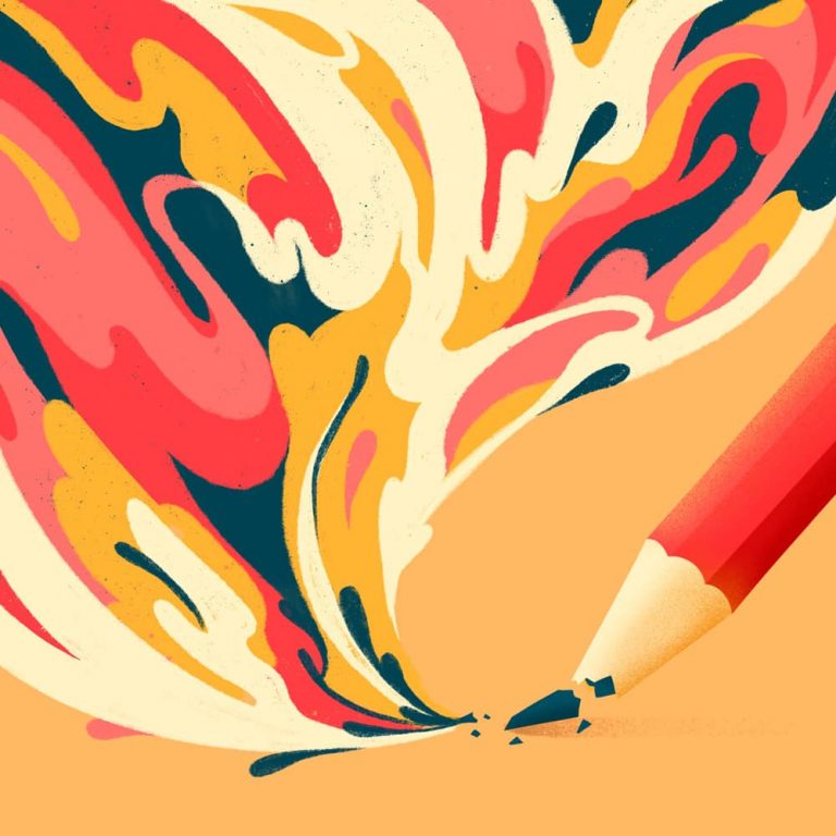
7 Color Tips for Aspiring Digital Illustrators
“I found I could say things with color and shapes that I couldn’t say any other way – things I had no words for.”
Georgia O’Keeffe
Both in digital and traditional illustration – colors play a great role in how we perceive an artwork. They directly influence what feelings the image arouses and what details catch our eye’s focus when we first look at it. Color management is a powerful instrument of any artist who knows how to use it well.
Here I will not dive deep into complex color theory in this article. That deserves a separate discussion and serves a different purpose. Instead I want to provide you with my top 7 tips which I use myself as a practicing illustrator.
Use these 7 practical and simple tips to become better in using colors. These tips do make a difference and they are easy to follow. Whether you are a beginner, or a seasoned artists, these techniques work for everyone.
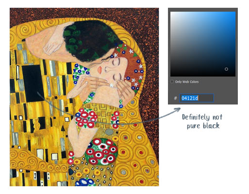
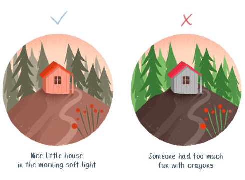
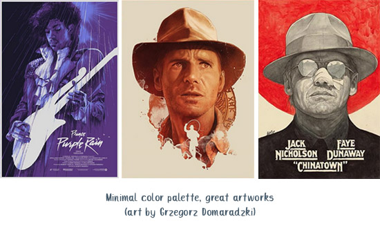
Tip 1. Avoid using pure black
To put it simple (and maybe just a bit scientifically) Pure black is an absence of light. It can exist in nature (when there is no light at all) but is extremely rare. We don’t observe black holes every day, right? What we perceive as black is in fact a mix of darkest shades of other colors.
What does all this have to do with illustration and digital art? Well, when we draw characters or objects inside some environment the black elements they contain are always affected by the surroundings. For example black hair or costume will appear dark brown in the morning warm light and dark blue on a winter evening. By the way, impressionists of the past were known for not using black paint at all, as they believed that in nature all colors were made by mixing.
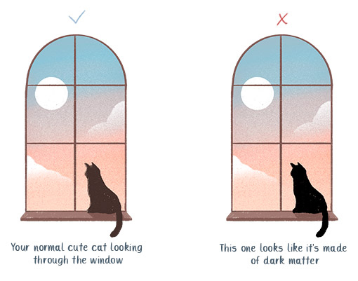
Unless it’s a black and white illustration or a very stylized drawing, usage of pure black color (#000000) won’t do you any favor. Even the deepest shadows look more realistic and vibrant when you use dark shades of nearby colors.
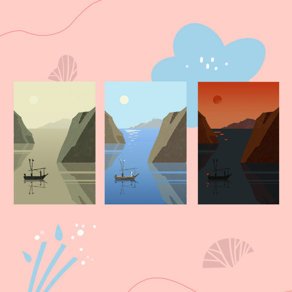
Tip 2. Use colors to display emotions
Colors can be a great tool to convey certain mood in your artwork. With the right selection it’s easy to make you art sunny and joyful, dark and gloomy, or dark and mysterious, etc. Color palette is what instantly tells our brain what to expect even before we start going through the details.
Pastel color palettes are great for dreamy and serene compositions. Battle scenes require more contrast and energetic coloring. It may sound rather obvious, but there are a lot of young artists out there who like to use bright colors for almost everything they draw. It may look good when those illustrations are lined up together as they all form one style of art. But it may blur out the emotions of each individual work.
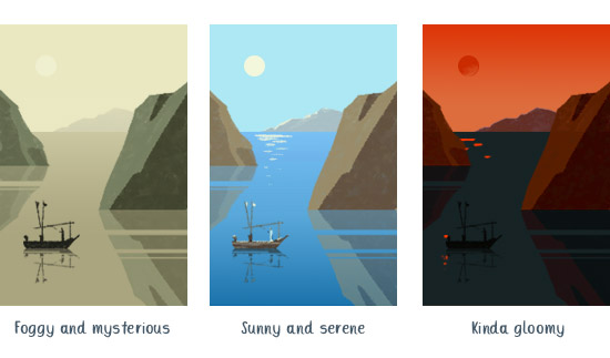
I’m not talking about the cases when your color scheme is predefined by a client (for example if you need to draw illustrations for the brand which has red and yellow as their corporate colors). However, if you really want to put emotions in your work consider choosing your palettes according to the subject. Simply ask yourself – what emotions do I want to evoke with my artwork?
Tip 3. Add contrast and accents with color
Colors can help you emphasize important details of the drawing and place the right accents. Contrast is considered one of the key principles in art and is an extremely powerful tool for artistic expression.
When we think of contrast, the first thing we probably imagine is a black and white ink drawing. In other words a combination of something light and dark. But it’s only one of 3 kinds of color contrasts. These are color contrast options:
1) Between light and dark (value)
2) Between saturated and dull colors (saturation)
3) Between complementary colors (hue contrast).
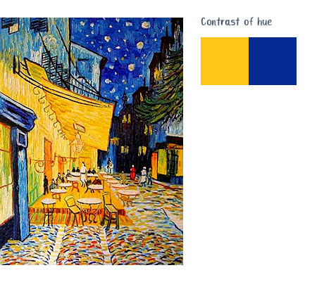
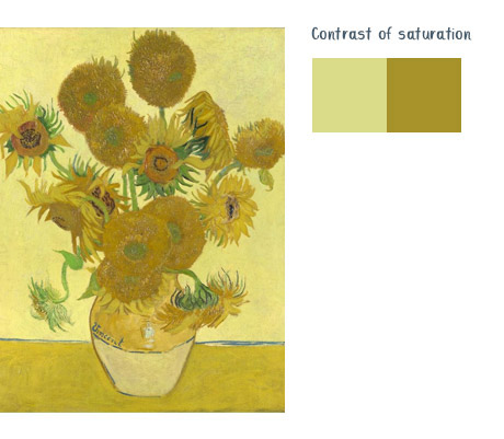
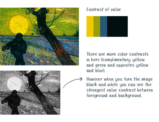
Experiment with each of these options. A clever usage of contrast in your artwork can guide the eye of the viewer and highlight the important details you want to bring into focus.
Tip 4. Do not forget about environment light
Environment or surrounding light is what makes white dresses look blue in the shadows and leaves appear bright green on a sunny day. Environment sets the whole atmosphere of the drawing and defines the overall brightness, temperature of highlights and shadows and level of contrast.
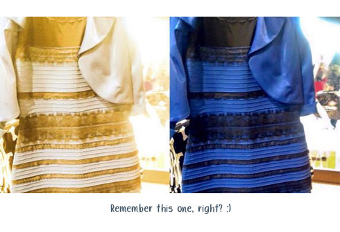
We artists often concentrate on drawing characters first and think of the background later. Digital art nowadays allows us to be flexible with how we paint and adding some background layers is not a problem. Though in order to make the drawing look natural and the character fit in the artist should always take into account the environment and the lighting sources.
If your character has a green jacket it would not be the same green on a foggy morning as in a bright summer light. You should consider the light sources that affect your object. Your person in a green jacket sitting in a cold shadow under the tree vs the same person 5 minutes later standing under the sun will definitely require different coloring.
Tip 5. Do your research for stylizations
Sometimes we deliberately want to reflect a certain style or epoch in our illustration. It can be anything from accurate stylization of an Art Nouveau style to an European vintage travel poster. In any case you should not forget that colors play an important role in reflection of that particular historical period in art.
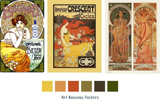
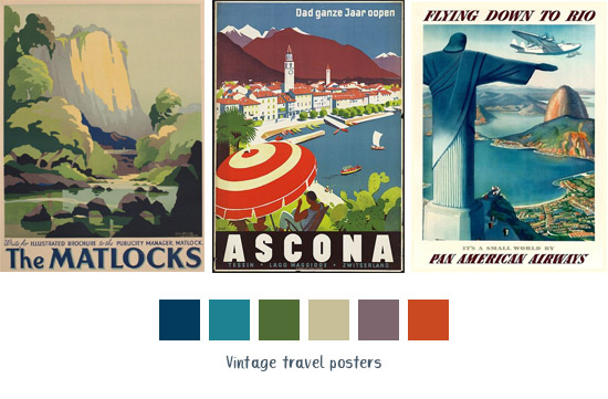
If you dig deep enough into history, you will 100% find interesting facts about traditional colors in different cultures. Or how they affected color choices in artworks. A particular era often has a particular pallet.
Here is an example for you 🙂 During the time of samurais in Japan there were special colors assigned for different members of society. So if you decide to draw a noble Japanese family of the past, choosing white clothes would be a bad idea as it was a color used by folks of lower social circles.
Tip 6. Make use of the good old color wheel
Even if you never studied art before you probably have seen the famous color wheel at least once or twice in your life. It was invented by Isaac Newton and has been successfully used ever since in color theory and related areas.
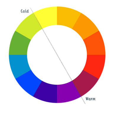
Color theory is incredibly complex. But as artists we are interested in understanding the relationships between colors and how to mix them. So here are 3 useful tips you can concentrate on and use in your work:
- The right part of the wheel represents warm colors and the left one is for cold ones. Warm colors are perceived by our brain as active and lighter while cold ones are more calm and distant.
- Colors sitting together on the wheel are perceived as harmonious. They are great for shading and highlights. Use them to add more life to a chosen subject.
- Colors located on the opposite sides of the wheel create the highest contrast – so be accurate with them. If you really need to put green and red together – make one of them main and leave the other one as an accent or play with saturation.
Tip 7. When in doubt – simplify
Mastering colors is not an easy job and needs time and practice. For some of us working with colors may be harder than for the others. But it doesn’t mean that it can not be trained and learned. On the contrary.
But If you feel uncertain using colors, a great way to help you proceed would be deliberately limiting your color palette. Try using 2-3 colors for your art at first or even start with black and white. Challenges like Inktober are great for such practice.
Making it simple can help a lot. When you don’t overthink about what tint of green to choose for the grass or what color the skin of the character should be, you start paying more attention to other parts of your work. Like your composition or particular object detalization. This technique of simple palette will often not only make your drawings look more sophisticated but also will train your feel of contrast and balance.
Conclusion
Color theory is rather complex if you start digging into all the details. But as digital artists we don’t have to study it for years to become skillful in managing our color palettes. There are certain techniques and tips we should keep in mind when we create artworks. They are not that hard to follow but any creator can benefit from utilizing them.
I hope my experience will help you develop the necessary skills and create some stunning visual art 🙂
Save in Pinterest for later 😉


Amazing!