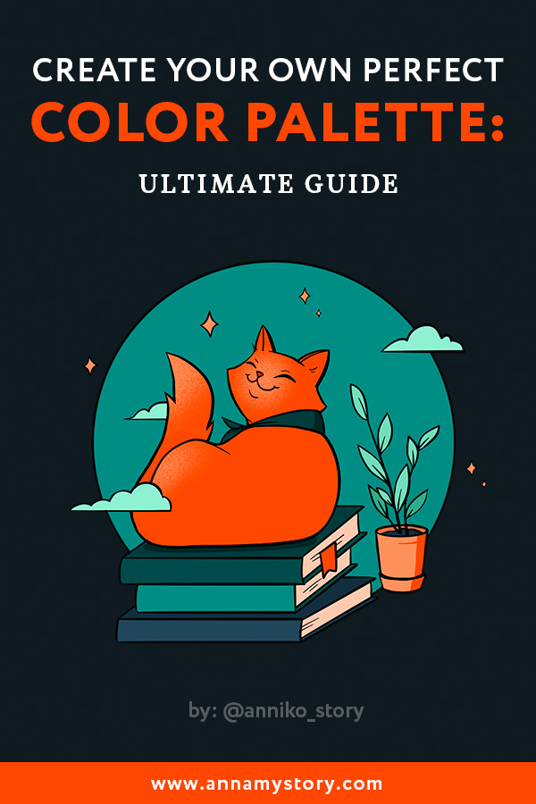
Create a perfect color palette: Simple guide + Examples
Combining and mixing colors in a right way can drastically change the impression you make on the viewer through your artwork. Today it’s really easy to find plenty of websites with online color palette generators. They do it automatically based on predetermined algorithms. Don’t get me wrong as a digital artist myself I do appreciate power of technology. But when creating art I always choose color palettes based my own taste and feelings. Letting some program decide what colors you should use is a bit boring, don’t you think?
This article explains the most practical and easy-to-learn tips for building color palettes based on my professional experience. I will lead you through the process using my sketch as an example at each of 7 steps. Don’t worry we won’t be diving deep into complicated color theory. By exercising these tips you will be able to create a perfect color palette without any online generators. All you will need is your creative imagination. Let’s begin.
1. Define your subject and emotion
Choosing your colors, think about what you are actually going to draw. Ask yourself:
— What is your subject? (Landscape/portrait/comic scene)
— What mood do you want to apply to it? (Cheerful/gloomy/romantic?)
The answer will help you to choose the right colors for your palette.
For example, if you drawing a night scenery you’ll definitely need a variety of dark tones. If it is a portrait, you are creating, think about main skin colors etc.
Same with the mood of your artwork: for a serene romantic scene you may want to use pastel and light colors. For a superhero battle scene you will probably do good with some bright and energetic colors.
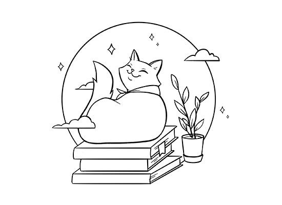
I will show you my coloring process on the example of this cute kitty sketch below. As you can see there’s not much drama going on with it. On the contrary my subject suggests using friendly, slightly dreamy colors. So that’s exactly what I will do in the following steps.
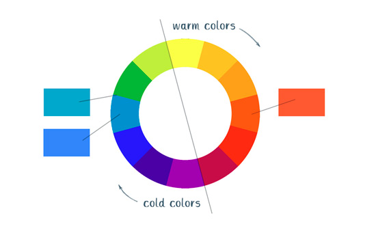
2. Get to know art principles (1): a color wheel
If you consider yourself a beginner artist you should start with basics. It will definitely help. And while there’s a great variety of basic art topics my advice would be to look up Sir Isaac’s creation, the color wheel. It can be of a great help when creating color palettes; that is if you know how to use it. Experienced artists don’t need to have it in front of their eyes to mix colors, but it’s really great for beginners.
Color theory is a pretty complex matter, so I want to highlight these 3 basic aspects you can use for your advantage right now:
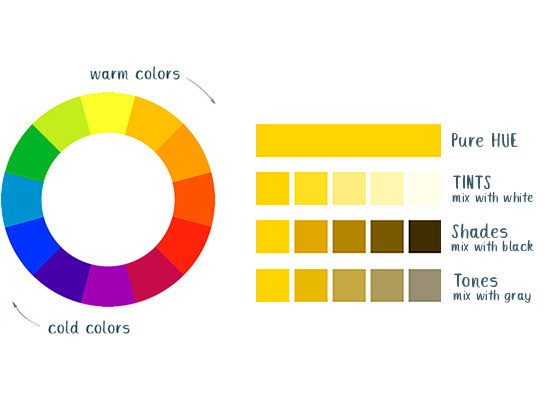
– The colors you see on the color wheel are HUES – pure colors without any whites or blacks mixed in.
– Colors on the opposite sides of the wheel have the highest possible contrast, the ones that are close to each other are more harmonious together.
– Besides HUE, color has such characteristics as TINT (mix with white), SHADE (mix with black) and TONE (mix with gray). This allows us to create thousands of great color combinations with variable contrast.
3. Get to know art principles (2): unity and variety
Now when you are familiar with color wheel and some of the most essential color characteristics let’s discuss Unity and Variety. Unity is a principle of art that gives an artwork a feeling of harmony and “oneness’’. It can be achieved by using close, complimentary colors from the color wheel.

But harmony alone can look boring. That’s when variety comes into play. Unlike Unity it can be achieved by mixing opposite colors. So if you’d like to add this ‘spark’ to you artwork consider selecting those for your color palette.

4. Limit the number of your colors
Mastering color can be tricky and if you don’t have enough experience yet, it’s a good practice to start with just 3-5 main colors first. It will make your work look more coherent and refined. You still have the whole palette to choose from, you simply decide which ones are the best for you.
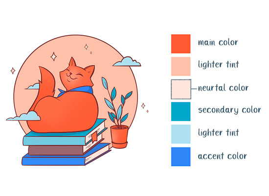
You may want to narrow down your choices to:
- 1 dominant color
- 2-3 secondary colors
- 1 accent color (optional)
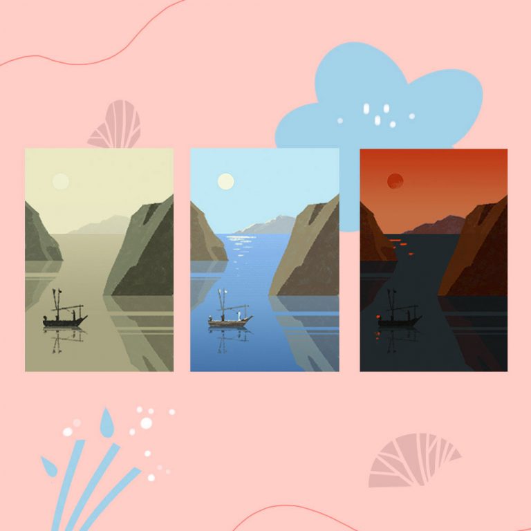
With my sketch I decided to go with triadic color palette: 1 hue from warm part of the spectrum, 2 hues from the cold one.
As you can see, I’ve selected lighter tints of blue and green, as I want my artwork to look more peaceful. I do not want it to have extra high contrast.
5. Start with big color blocks first
My next advice is to color big areas of your artwork first. It will help you to understand how your main colors interact in general, before working on details.
I usually start with my main subject and the background first. Whatever colors I choose they should have enough contrast between them. Otherwise they will blend with each other.

6. Don’t forget about neutral colors
One thing you definitely don’t want to do is to overwhelm your artwork with colors. Visual balance is quite important. So consider adding at least one neutral color to your palette.
It could be greys of different temperature (whites and blacks can work as neutrals as well. Though in their pure form they usually look too harsh in juxtaposition to the other colors (unless your aim is creating a very high, unnatural contrast).
Instead of going with a neutral gray, I advise you to choose a slightly warm or cool gray to give your subject more natural feel. In my case neutral color is a very light tint of the main orange color.
7. When in doubt — create thumbnails
With all the color variations our creative opportunities seem endless. And picking one might be a problem sometimes. Quite often we have a feeling of what our artwork should look but in the process of drawing it we find ourselves tempted to change it. Small rough color sketches can help you define the best color combination for your artwork.
Take your pencil sketch as a base and make several color variations. You can always change your decisions later on, but this small exercise will help you to define general direction. Don’t spend too much time on them or make them accurate, these are just for your own use.

Here I’ve tried different color variations from bright to pale and almost retro. I decided to go with warm oranges at the end as it seems to look rather friendly and well, I’m fond of ginger cats J There are no universal rules here, just choose whatever you like best.

Conclusion
Remember – there are no bad colors, it’s the way we combine them that makes the difference. Understanding what works best and what may be the defining feature of your own style comes with practice. And here you are limited by your imagination only. And maybe by actual paints if you are a traditional artist 🙂 So my most important advice is this – simply start drawing, experimenting and do have fun in the process!
As always if you find my article helpful, feel free to share and leave a comment.
Save this guide in Pinterest for later!